


Early on, when I first learned about HTML and CSS, I came across the concept of CSS units. They have such an important effect on the layout of the website. Before you know it, you're finding yourself using them for styling all the time.
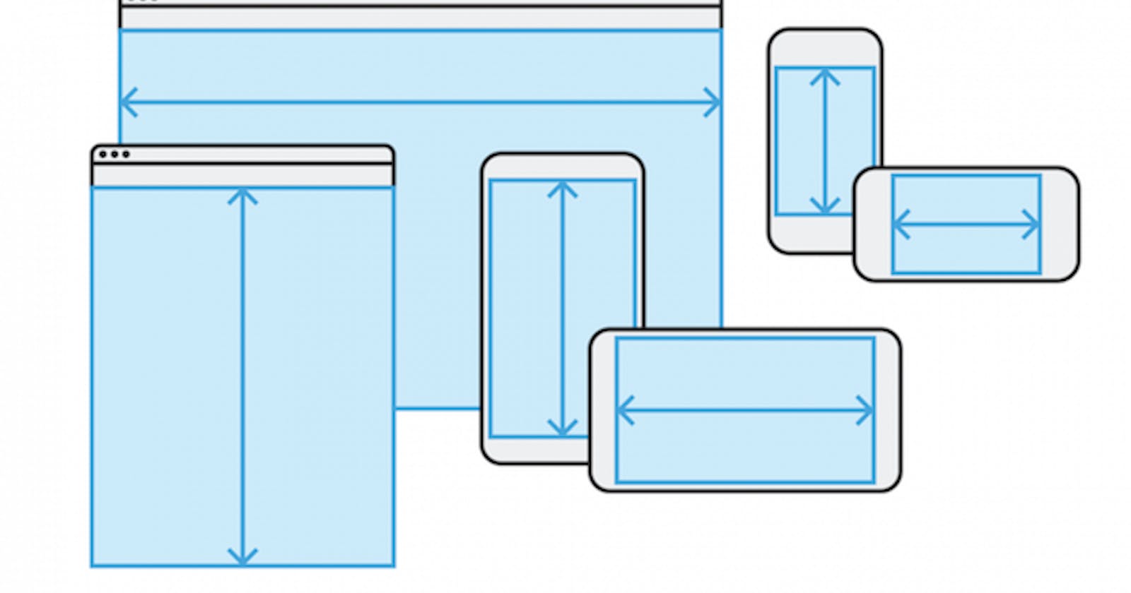
With the rise of mobile devices, responsive design has become more essential of a skill to have as a developer than ever before. Some developers are even taking a "mobile-first" approach when they first sit down to design their projects. Before building anything for the desktop, they'll start with phones and tablets.
What are CSS Units?
CSS units are how we express the numeric length of something. That length could be anything from pixels to ems. There are two distinct types of CSS units: absolute and relative units.
Understanding the relationship between CSS units and your site's layout will make the design/ build process feel much smoother.
Absolute Units
Absolute units are fixed measurements; they are the same size no matter what size screen you use.
The most common absolute unit is the pixel, px, since our screens are measured in pixels. This can be a great starting point in understanding how CSS units can affect the layout and look of the site's content.
There are several other kinds of absolute units, like cm and in, but they are less common and seldom used.
Relative Units
Relative units, on the other hand, are units of measurement that are set relative to another measurement (usually the parent or root element).
By their nature, relative units responsively adjust to whatever screen you're using. My experience with learning this tells me that relative units can be challenging to understand at first. But after much practice and re-learning, I realized that, when they're used right, relative units can be very handy.
The most common kinds of relative units are ems and rems.
em :
ems are units whose length is relative to the font size of the parent element.
Say, for instance, I have a wrapper <div> with a font-size of 18px, and inside there was a child <p> element and I changed the child's width to 5em.
Because the parent element has a size of 18px, that is equal to 1 em. Therefore, since the child element has a width of 5em, it's actual width is going to be 90px (18 x 5 = 90).
rem :
rems are units whose length is relative to the font size of the root element. (The default size if 16px)
The root element is expressed as a pseudoclass in CSS as :root. The root represents the <html>...</html> element in the HTML document. This means that if you were to go and change the font size of the root, all the elements inside the HTML document would change relative to that.
While I personally don't use rems that often, they are a popular relative unit-of-choice like em.
Which one should I use for which situation?
Rule of Thumb: use relative units as much as possible**. Most likely, whatever you build may be running on devices with different screen sizes. If you know the screen size ahead of time, absolute units would be fine.
If you're going to use a mix of rem and em, it might be a good idea to limit rem to "global-sizing". This means: adjust elements that are as close to the root in the DOM tree with rem, and use em for "local-sizing" on everything else.
Ensuring your content remains properly sized and proportioned, no matter what the screen size, is essential to good responsive web design.
Happy coding, friends!
Resources
5 Essential Reasons You Should Be Using A Responsive Website Design Now